


Transform Your Living Spaces: Tips from Designer Nicola Harding
Homeowners today are increasingly aware that the spaces they inhabit should not just meet their functional needs but also express their unique tastes and enhance their well-being. Leading the charge in this vibrant trend is interior designer Nicola Harding, known for her fearless approach to color. By embracing a nuanced palette, Harding infuses life into even the most unassuming of spaces. Here, we delve into her distinctive strategies that challenge conventional design wisdom, inviting you to rethink how color can transform your home.
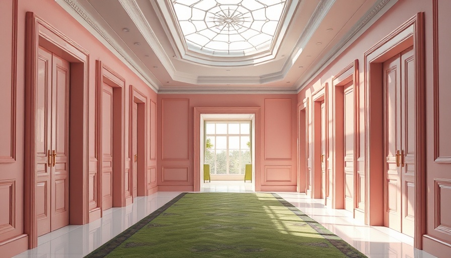
The Magic of Green: Nature’s Palette
According to Harding, one of the simplest yet most effective ways to anchor an interior design is through the use of green. "You can’t go wrong with green," she states, pointing out that leafy hues not only connect the indoors with the outdoors but also instill a sense of calm and balance. In her recent project, she masterfully intertwined shades of leaf green and olive with vibrant reds and blues, crafting a home that breathes life. Her philosophy emphasizes that green should be a unifying color that draws the eye around the home, linking spaces together like a thread running through a tapestry.
Natural Light and Space Considerations
Harding's expertise also highlights the importance of natural light when selecting paint colors. "Go pale (but not necessarily white) in a big, busy space," she advises. Her strategy involves observing how light interacts in various rooms, adjusting her color choices accordingly. For well-lit areas, lighter shades enhance openness, whereas darker hues bring warmth and drama to more confined or dimly-lit spaces. This keen awareness not only optimizes aesthetic appeal but significantly impacts the functionality and overall feel of the environment.
Bold Choices for Mood Enhancement
Harding's fearless use of color includes moody blues that imbue tranquility in spaces where families gather. In creating a peacock-blue orangery extension, Harding showcases how blue can serve as both a calming backdrop and a complementary tone to warmer shades. This approach reminds homeowners and designers alike of the importance of combining colors thoughtfully to create a rich, layered atmosphere that resonates with personal history and emotion.
The Jewel Box Effect: Transforming Small Spaces
In small areas, Harding suggests embracing dark and shiny shades to create an intimate ambiance. Utilizing darker colors on walls in conjunction with glossy finishes gives the feel of a jewel box, creating a cozy yet visually stimulating experience. She illustrates this concept with a bar area richly coated in Tanner’s Brown, allowing glossy tiles to reflect light and add depth. For many homeowners, understanding the transformative power of colors can tip the scales toward creating vibrant, inviting nooks in their homes.
Playing with Contrasts: Trim and Woodwork
Turning conventional design on its head, Harding often opts to paint woodwork in darker shades compared to the lighter wall colors. This not only draws the eye to the view beyond windows but also imbues spaces with an enhanced sense of dimension. Such techniques encourage homeowners to embrace the boundaries of their creativity and think beyond rigid color schemes.
Bedrooms and Serene Styles
Harding firmly believes in using restful colors in personal spaces. In a serene bedroom, she showcases Pure & Original’s Calm paired with soft mauve ceilings, creating a sanctuary that emphasizes relaxation. This concept is crucial for those who find themselves overwhelmed by modern life; color selection becomes a potent ally in setting the emotional tone of a room.
Dare to Go Bold with Guest Rooms
However, Harding doesn’t shy away from injecting boldness into smaller guest rooms. Employing eye-catching wallpaper and colorful paints creates spaces that are inviting yet lively, ensuring that each room tells its own story. The juxtaposition of daring decor evokes excitement, breathing freshness into traditional design narratives.
Wrapping Up—The Delight of Color
Ultimately, Harding’s approach vividly illustrates that color is more than just aesthetics; it’s about creating a narrative that boosts daily lives. As trends in home design continually evolve, engaging and enriching color choices remain timeless, offering emotional comfort and delight. So whether you're redoing a single room or planning an entire home makeover, don’t shy away from boldly embracing color. A thoughtfully curated palette can transform a standard living space into a vibrant sanctuary.
Explore these ideas by visiting nearby home improvement stores or interior design exhibitions where you can see how colors can alter perceptions of space. Dive into the world of color; it’s not just about paint, it’s about creating your narrative.


Write A Comment