


Refreshing Your Space: The Ultimate Spring Color Palettes
As the chill of winter melts away, spring arrives with vibrant colors that breathe new life into our homes. This season, it's the perfect opportunity to refresh your living spaces in a way that feels alive, inviting, and harmonious. While pastel colors often reign supreme during spring, let's explore some enchanting alternatives that embody warmth and personality. Here are six captivating color palettes that will transform your home this spring.
Moss Green and Beige: Nature's Embrace
Moss green evokes the essence of the great outdoors, offering an earthy ambiance that draws us in. When paired with beige, this combination creates a grounding influence, making any room feel cozy and welcoming. Consider a moss green accent wall paired with beige furnishings; this pairing harmonizes beautifully with natural elements like wooden furniture and woven textiles. Enhance this palette with botanical prints or warm-toned ceramics, bringing the freshness of the outdoors inside.
Butter Yellow and Gray: Bright Yet Sophisticated
Butter yellow is an uplifting hue that introduces warmth without being overpowering. When matched with stoney gray, this palette achieves a refreshing yet sophisticated look—ideal for kitchens or living areas. The gray tones balance the vibrancy of yellow, creating a refined backdrop that simultaneously adds cheer. This charming combination is both classic and unexpected, offering a joyful twist for your spring decor.
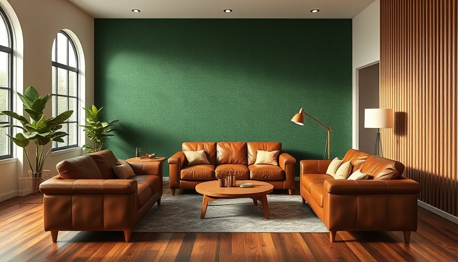
Blue and Terracotta: A Harmonious Duo
The combination of blue and terracotta brings together the expanse of the sky and the warmth of the earth in perfect harmony. This palette is ideal for bedrooms and living spaces, promoting a sense of calmness through the balance of cool and warm hues. Incorporate terracotta ceramics or cushions that add an organic, handcrafted touch, while blue accents can be introduced through furniture, walls, or bedding. This palette connects modern aesthetics to nature's beauty.
Sage Green and Taupe: Gentle Yet Striking
Sage green stands out as a muted inspiring shade, while taupe serves as a perfect understated complement. Together, they create a soothing atmosphere perfect for bedrooms and serene reading nooks. Use sage green in textiles or accents to pop against taupe walls or furniture for a refreshing feel without overwhelming your space. The combination is light yet striking—perfect for spring's gentle touch.
Rust Orange and Olive: Bold and Inviting
When you introduce rust orange into your interior, you're opting for vibrancy blended with earth tones. The rich warmth of rust orange adds liveliness, while olive delivers a unique, natural contrast, making it a fantastic palette for social spaces like living rooms and dining areas. You can use rust orange for accent chairs or artwork to create focal points while styling with olive cushions or decor to ground your setting.
Unexpected Palettes to Consider
Spring is also the time to venture beyond conventional palettes. As noted in a recent guide, combinations like soft pastels, bright tropical colors, or earthy neutrals can not only provide vibrancy but also evoke the rejuvenation of nature. Whether you prefer bright, energetic tones or subtle muted shades, the key is to reflect your personality and taste in your color choices.
Conclusion: Refresh and Revitalize Your Space
Incorporating spring's color palettes not only revitalizes your home but enhances your mood and overall well-being. Embrace these color combinations to celebrate the season's renewal, creating a welcoming space fitting for gatherings and quiet moments alike. Explore these palettes that resonate with you, and let your home bloom beautifully this spring!

Write A Comment