Bold Colors Transform Iconic Spaces
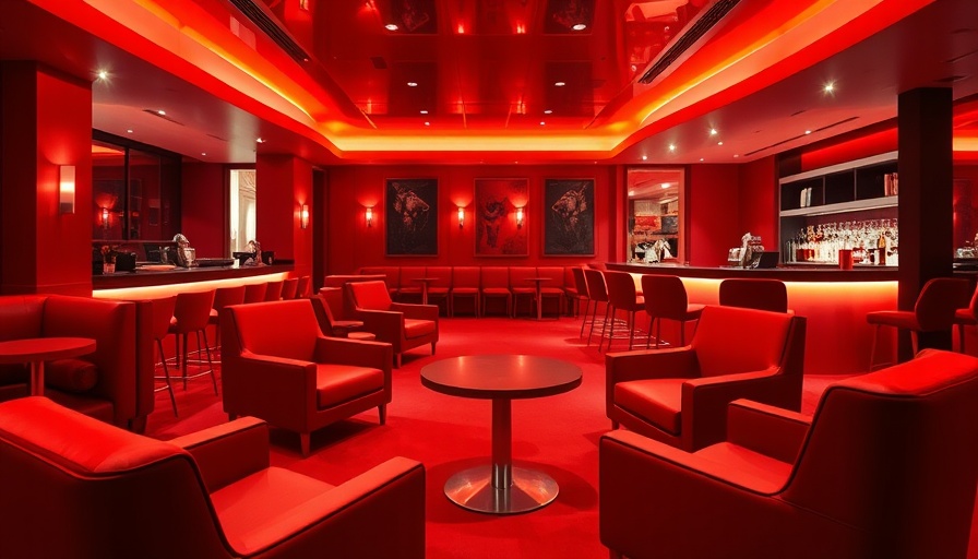
Madison Square Garden is renowned for its electrifying events, but the recent transformation of the Benjamin Moore Boardroom reveals a different kind of magic—one that focuses on color, texture, and the artistry of space design. New York designer Sasha Bikoff took on this remarkable project, creating a vibrant haven that not only honors the venue's rich history but also breathes new life into it. "I'm a storyteller," says Bikoff, and through her vision, each color has its say.
The Heart of the Design: Celebration
At the core of Bikoff's design philosophy is the celebration of life, and she harnesses the power of color to convey this theme. Red—symbolizing joy and festivity—was chosen as the primary hue for the room, as it resonates with both the spirit of Benjamin Moore and the local sports team, the Rangers. The choice is more than mere aesthetics; it’s about evoking emotions and creating a sense of connection with the space. As Bikoff puts it, "Red is the color of celebration; it brings warmth and energy to the room."
Color Drenching: A Design Technique Like No Other
Color drenching, the technique of enveloping a space in one or two hues, is pivotal to the room's overall look and feel. With hues such as Classic Burgundy cloaking the ceiling, Raspberry Truffle adorning the walls, and Neon Red accents, this method creates a mood that is both exciting and luxurious. "You walk in and feel like you’re in a jewel box," Bikoff explains. This immersive experience is achieved by treating every surface with harmony, ensuring that paint becomes the star of the show.
Textures Adding Depth to the Color Palette
But the drama in the Benjamin Moore Boardroom isn’t solely from the color; it extends to the room's textures. Custom millwork paired with rich chocolate brown countertops featuring gold and white veining softens the boldness of the reds while enhancing its opulence. Bikoff emphasizes the importance of texture in design, noting that it adds depth and interest, providing an engaging contrast to the gloss of the paints used. The result is a cohesive space that feels both sophisticated and inviting.
Lighting: The Unsung Hero of Design
No design overhaul is complete without the right lighting, and Bikoff gets it just right in this project. Chrome fixtures from Visual Comfort & Co. introduce a dazzling sparkle, illuminating the rich colors like a stage spotlight. Specific placement of glow and cove lighting brings the reds to life, creating a dynamic ambiance that shifts as you move through the space. "Lighting is probably second only to paint in importance," she asserts, highlighting its critical role in building atmosphere.
The Intersection of Functionality and Aesthetics
This is the essence of Bikoff's design approach: a space that is both functional and infused with beauty. By combining strategic use of color, craftsmanship, and innovative lighting, she has created a space that not only caters to functionality but serves as a sensory experience. For business owners and homeowners alike, this transformation exemplifies how thoughtful design can elevate an everyday space into a memorable destination.
 Add Row
  Add
Add 


Write A Comment